
Autumn 2012
Dan Rhatigan: All about workflow
Monotype’s UK type director talks about the way the company’s 125-year history informs its approach to twenty-first century challenges.
Dan Rhatigan is the UK type director at Monotype. He first started working with the company in 2008, initially as a researcher and consultant employed by the University of Reading, studying non-Latin typefaces that were primarily used in India. Rhatigan’s work with Monotype currently centres around the development of Monotype’s intellectual property, and involves working with the company’s extensive library of type, which dates back to the late Victorian period.
Throughout his career, Rhatigan has contributed to projects for a wide range of clients, including the BBC World Service, the American Civil Liberties Union and Performance Space 122. For the past four years, Rhatigan has also taught part-time at the ArtEZ Institute of the Arts in the Netherlands.
He was born in 1970 in Staten Island, New York. After a BFA
in graphic design at Boston University he worked for three years as senior typesetter in the university’s publications office. From 1995 to 2006 he worked in a variety of design-related capacities for employers including the PBS television stations Thirteen / WNET New York, and the American Society of Mechanical Engineers.
He came to the UK in 2006 to do the MA in Typeface Design at Reading University, beginning his association with Monotype by winning the Monotype Foundation scholarship.
A fold-out poster from The Monotype Newsletter promoting Gill Sans Ultra Bold (October 1934).
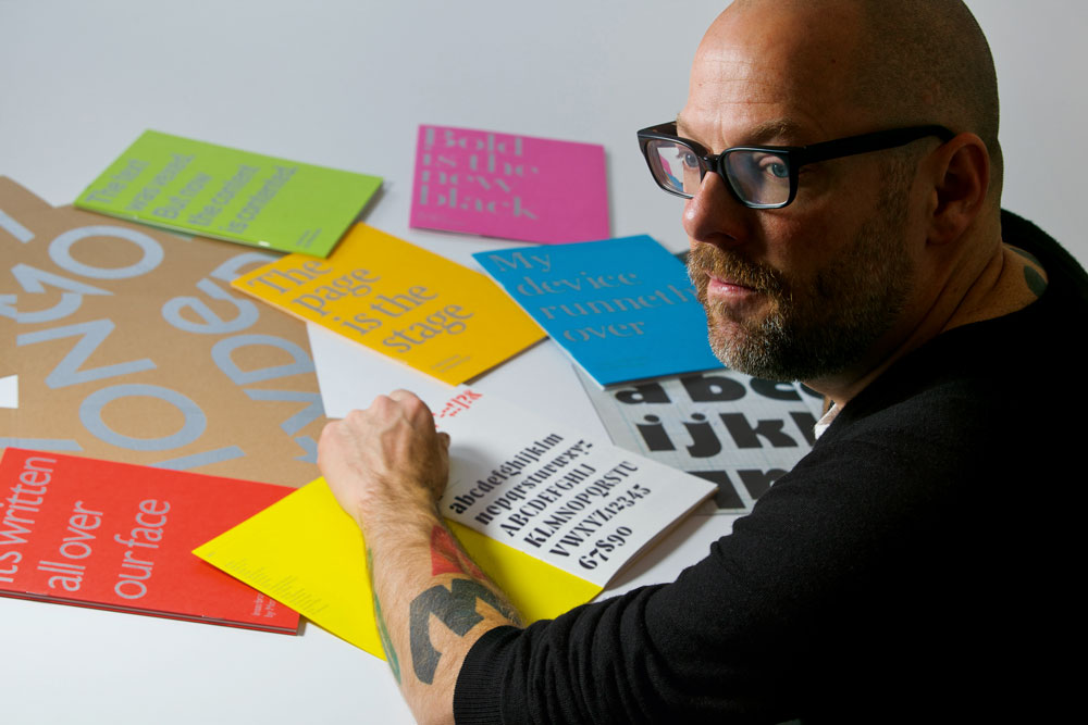
Top: portrait by Phil Sayer.
Eye: How did Monotype strike you at first, before you worked for the company?
Dan Rhatigan: From the perspective of a type historian and a type user, I feel that Monotype’s story today is deeply tied to its story from 120 to 125 years ago. People who are printing, publishing and doing advertising need the typefaces, but they have a variety of needs. Monotype has always been in the business of getting those typefaces to people. It was originally a machine company, but it only took a couple of decades for them to realise the machines will keep on evolving but the actual value was people’s awareness of the different typefaces available. Monotype survived because they kept adapting the means of providing typefaces, building out this array of choices in the library over the years. Our customers say: ‘This is what we’re trying to do and we want to use these typefaces. How can you make it possible for us to put these typefaces on the dashboard of a car, a billboard, a website or this magazine masthead?’
Eye: So it’s doing now what it was doing at the beginning?
DR: Pretty similarly. If you think that the first custom typeface that Monotype did was Imprint [in 1912], which a publisher specifically requested. People weren’t thinking of Monotype as just a company that deals with machines and throws a bit of type in it, but actually the source of the typography itself. The real flourishing period came in the 1930s when you began seeing typefaces such as Times New Roman and Gill Sans. Monotype became so deeply embedded in workflows that they created this space for using type and creating a demand for typefaces.
Eye: It’s fascinating to hear the term ‘workflow’ applied in that way.
DR: It’s such an obvious connection to me. The Monotype machines (and the Linotype machines) were very much about consolidating the varying tasks that went on in a printing office, and channelling the workflow into a machine set up to move things along more efficiently. That was the explosion in printing and publishing – that came from mechanical typesetting – which led to this demand for printed stuff and this demand for typefaces. And it’s really all about workflow. But when the workflow problem radically changed, it led to greater demand and greater variety. With people printing more things, they wanted more personality in the typefaces.
Eye: When you came to these conclusions as a consultant, were you telling Monotype something people there already knew?
DR: It’s not a great revelation. However, most people had not thought of pulling it all together within the company in quite the same way. There are a lot of people that I’ve spoken to in the office, even in Salfords [home of Monotype since the turn of the twentieth century], who had never been back into the archive, those shelves of treasure. I invented excuses to go exploring in it because I was so fascinated by it.
Eye: Is that what you found in the archive? A pharaoh’s tomb of treasure?
DR: Absolutely. My first introduction to that body of material was when I was studying at Reading. I was researching the Monotype Four-Line system, which is a workflow solution that makes it easier to set mathematics. I didn’t go into the archive, Robin Nicholas (see pp.68-79) just pulled out a few relevant folders for me, but every time I dug deeper I just found more things. The more I learned about the history and about what we were doing today, in parallel, the more it became clear that it was the same thing. There is a very clear lineage, in Salfords, from 1897 to where we are today.
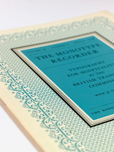
The cover of a special issue of The Monotype Recorder (vol. 41 no. 2 Spring 1958) devoted to typography for the British Transport Commission. The cover design, of a kind very fashionable at the time, was composed from Monotype’s rules, decorative sorts and borders.
Eye: So Monotype was one of the great start-ups of the late Victorian era?
DR: People see Monotype and Linotype as the revolutionaries at this time, because they survived. But there were lots of companies that were doing the same thing. After the revolution of what Gutenberg did, there were small evolutionary steps for the next 300-400 years, but you still had a whole bunch of cases of type that you had to keep around a printing plant.
So you needed a big room, big enough for all the type, and enough people to compose it, to put it on the press, to put it all back… So what Monotype and Linotype each did in their own way was to pull all of that together, and get rid of the cases of type and people putting it all together manually. Essentially, you were spitting out pre-composed galleys of text that could be dropped on the press, then spat out, then another galley, and dump the lead when you were finished.
Linotype worked better at volume and Monotype was better at finessing, because you were getting individual sorts. The Monotype machine was, in a way, more of a self-contained type factory, whereas Linotype was very much about getting those galleys of text out there so that you could put newspapers, magazines and books onto the press really quickly. Monotype was a little bit slower, as it was putting out single sorts, which had to be tied up and bound. But you could also manufacture type for hand composition.
Eye: Is that why those two companies survived? Out of all those rivals?
DR: Yes, a lot of places had both Linotype and Monotype machines. Monotype was more deeply involved in printing houses within the UK than Linotype, which is part of the reason we survived much longer than the American Monotype company. Linotype was hugely successful in the US, but both were all over the world. And it was that mix of display or finely set work, and the speed and utility of getting those galleys that made them so central. Although the companies were competitors, there was a fair bit of cross-licensing between them.
Eye: Times New Roman was pioneered by Monotype but The Times also used Linotype…
DR: That’s correct. There was a period when both companies were developing new faces … as an incentive to invest in a particular machine. If you want Gill Sans, you need a Monotype machine. If you want Metro, you have to have a Linotype machine. Eventually there was a crossover. Helvetica and Univers, as well as Times New Roman, were used by both companies.
Eye: Has Monotype always dealt with big publishing companies?
DR: That’s where quite a lot of revenue comes from. But you do have to appeal to designers, students and educators, because you also need to work closely with the types of people who are going to specify typefaces to be used in these large organisations. You can’t let any part of the audience drop. You have to just reach them the right way.
Eye: Where do the designer and typographer fit into this equation?
DR: Stanley Morison (see pp.84-89) actually functioned as a design director within the company, in the way that a graphic designer in another organisation would. He took on the role of curating this library and developing projects and saying ‘these are the appropriate typefaces that should be put into use’. He talked to customers to get a sense of what they wanted, but also to tell them about what they should be using, the same way that a creative director in an agency might say: ‘These are the typefaces that you should use because they say this, this and this about your brand.’
That’s why we do have to operate at these two scales. Because of our extensive library we’re educating customers at the same time that we’re pitching to them. At the moment it happens quite a lot with technologies such as webfonts, and we are forever teaching our customers about the options for their situations. We recommend typefaces constantly. Designers have been exposed to a few typefaces but they might not be aware of all the options.
Eye: Is it a case of choosing new typefaces, or retooling and adapting the existing types within the library?
DR: Most certainly both. I’ve had people say that they weren’t aware that Monotype still makes new typefaces. Which is frustrating, because we release a typeface family a month! Not to mention the language extensions and weight extensions that trickle through all the time.
In a way, that’s why the history of the company is a bit of a burden, because new releases can often get lost in that 100 years of development. A lot of people come to us because they’re aware of our typefaces – they’ve seen them at school so they come to us because we have those classic typefaces. We get quite a lot of requests for a version of Baskerville or whatever – which is what we do, we do a lot of customisation of typefaces – but when we ask what they’re trying to achieve we can make them realise that while a different typeface from the library might work well enough, actually they need a new typeface altogether. Teasing out what they want is part of working with agencies instead of just being a shop.
Eye: Monotype was also a huge manufacturing company that employed thousands of people to make complex machines. Design was like a little cab on top of a huge truck. Does the design side, the intellectual property side, take up a bit more space now?
DR: Not really. If you think about it, it’s the way business functions. The designers are producing something that is just one part of an overall way of making things and getting them out into the world. But there is more of a sense of ‘design’ in the mix than in that golden age where someone drew some letters and an army of people turned them into typefaces.
One of the joys of working with Monotype is that great library of type. The typefaces that you grew up on are all there. But there’s a problem with backwards compatibility when a company has been around for that long.
The means of working with type have changed so dramatically that the time is really ripe to look at the best of the Monotype library – and perhaps faces that were overlooked, which could be made fresh again – and begin to take out some of the problems imposed by the unit system (see note, below).
Also the fashion has changed. The weight of typefaces people prefer today strikes me as entirely different from the digital fonts that were available when I started out. People at Reading [University] have had this conversation over and over again. The overall colour of typefaces has changed because people are proofing on a laser printer and they’re designing for that result. Whereas the first digital fonts were replicating original sources of typefaces that were for letterpress and photo printing, where the end result is pretty different from the drawn stuff.
Eye: All that work designing a typeface so its true character was revealed when it was punched into metal … is that meaningless in a digital environment?
DR: Things were adjusted along the way. Spacing was re-adjusted with every generational shift. But with things like the deviation from striking a steel punch into a brass matrix – there are no true verticals in the original fonts to correct for that deviation – that was adjusted for digital type; if only because vertical lines set much more easily in digital type.
The more we look at the older typefaces, the more we realise that there’s nothing but potential in them. They exist, now, as products, and so people can have them if they want, but why can’t the spirit of those designs meet newer needs? I’ve worked on quite a few custom projects that began with a seed of something from the library.
I have been working on a couple of variations of a Modern typeface. There were variations of Monotype Series 1 [Modern] in metal over the years, but the digital fonts are pretty straight digitisations and they look weird because they are not set in metal and printed in letterpress. Returning to that typeface for some custom projects, I really felt that the fitting needs to change and the proportions really need to change. Because all these counters ought to be the same size. They shouldn’t be gently squeezed and expanded to fit where it could go in the unit system. When you pull out all those bits of influence from the mechanical restrictions, you see a whole new vitality that feels quite contemporary, even though it’s a 120-year-old typeface based on an even older source.
Eye: Is there a danger that – since some of a font’s characteristics are in its very eccentricity – you might lose something?
DR: Gill Sans! That’s the classic example. But every time that you try to pull it out of its context it becomes another typeface altogether. You can’t call it Gill Sans if you remove it from those decisions that made it what it was at the time.
Eric Gill was a letterer, so his expertise was to do with constructing letters in situ, how they would have been shown on signs and how they would be cut into a given stone. There was the collaboration with the drawing office that adapted that thinking into type, repeatable elements that had to work in different combinations in a given system. Some of the eccentricities come from Gill’s sensibility; some of it from getting the spacing and proportions right using the Monotype unit system. And when the family grew, it was not conceived as a family in the way that, say, Univers was.
Gill Sans was just wildly popular and if you look at the Gill Sans family it’s like: ‘Oh, people love Oreos! People love Oreos with chocolate in the middle! People would love Oreos if they had vanilla biscuits on the outside!’
Gill Sans grew organically and it’s not a family in the sense that you can clean it up and build multiple masters and interpolate the intermediate weights. When you rationalise all of those decisions and try to impose a system, you realise that Gill Sans takes a very ‘asystematic’ approach to type. Very characteristic of when it was designed and of when it was used. We have been working on projects to update Gill and really it just becomes: ‘You can tweak a little bit, you can put in alternate ones that have hooks or crossbars. You can touch up some things to improve the legibility or adjust the spacing but there’s not a lot that you can do to the shapes.’
Eye: Looking through all the Monotype Recorders and the Newsletters, Gill Sans is the archetypal story. You see the L.N.E.R. (see p.54) adopting it as their corporate typeface, with the typeface on the menu, on railway timetables and on the front of a train …
DR: Yes, Gill Sans can be used so beautifully. Yet when you look too close, it’s messy. It’s like looking at a close-up of your skin – ‘My pores are awful!’ Gill Sans can be used really beautifully but it’s difficult to use well. In part because people don’t see as much of it as they used to, so you can’t just drop it into a layout and have it work. It does require a certain sensitivity. But for decades it was used so often that that sensitivity was there.
Eye: Gill Sans was very successful. But you can’t always predict market demand, can you?
DR: Typeface design is often very speculative work. Almost all foundries try to find this balance between coming up with original typefaces and bringing them to market, and having customers that pay the bills to support all of that work.
Every time someone says: ‘We need the next Helvetica’, I respond: ‘What’s the next Helvetica? What is going to capture people’s spirit?’ You’re making typefaces that other people have to work with so, unless it’s a custom job where you know exactly what the context is going to be and what demands are going to be placed on the typeface, you have to make an educated guess as to what the typeface needs to do and how it’s going to do it.
You have to prepare a typeface so that people who are not great typographers get a good result out of pouring it into a layout, dropping it in a headline. So you have to work out what is the best internal rhythm, what are the right proportions, what’s in tune with the shape of the letters and the overall family.
It’s intuition, not sales figures, that will probably tell you what’s going to be successful. Often, by the time someone tells you to go out and see what kinds of typefaces people are using, it’s too late for you to do a typeface like that. You have to take a longer view.
Helvetica is popular because of a variety of moments in history. It was right for the way in which visual culture was changing. It could be adapted for logos and publications. Helvetica was an evolution of a much older typeface style, but it was right for the moment. It could be very heavily promoted and advertised because there weren’t hundreds of foundries releasing and promoting typefaces. Where it sat in terms of technology shifts was also important. Yes, it was licensed for everyday things like Letraset and sign-making shops, but when software manufacturers needed some typefaces for their computers, they just asked for the most popular typefaces that everyone knew. Then, all of a sudden, Helvetica and Times New Roman became ubiquitous and maybe Helvetica was a bit more contemporary.
Eye: Any other typefaces in the library you have a desire to revisit?
DR: I’m having a love affair with the Moderns right now. Particularly since so few of them made it through to digital versions. They don’t exist as a family that works but I think there’s so much potential, so I’d really like to keep working in that genre. They’re beautiful, they’ve worn well.
Eye: They predate all of this stuff that we’ve been talking about. They were the generic proto-typefaces before Times New Roman.
DR: What also appeals to me is that connection of something from the past that can be made contemporary by really thinking of it in a contemporary context. I’m excited about this wildly expanded revival of W. A. Dwiggins’ Metro typefaces that Toshi Omagari has done.
I’ve been nudging that through the channels because I love it and it brings life back to a typeface that I like. It’s due for release in April 2013. I’ve been trying to look for slab serifs in the library – people are interested in slab serifs now and I’m trying to find the one that I’m drawn to. There are a couple of typefaces that I believe have been overlooked. There’s one called Emerson that I like. I don’t think it was even converted into phototype.
Eye: It’s fascinating to see something like Albertus being pushed quite heavily by Monotype at one stage (looking at those copies of the Recorder).
DR: In the library we have little sketches of how you would handle certain typefaces. I know Toshi has drawn a new lowercase for Albertus because he thinks that they just didn’t work – the same way that I’ve tried to do variants on Gill Sans to wrap my head around the problem. I did a custom rounded version of Gill Sans in a couple of weights, which worked pretty well, so I immediately tried to do a rounded ultra bold. It’s a bit too much! Nothing has taken root except for the Moderns and I look at those things and poke ’em with a stick now and then to see what happens.
Eye: We’re at the cusp of a shift in technology as we see lots of different webfonts now on tablets and mobile devices. Do you think that’s going to change tastes?
DR: I absolutely do. Slab serifs, for example, survive better in popular environments like the Kindle. E-ink screens need much more robust typefaces, but even as regular webfonts, slab serifs are sturdy enough to handle the variety of outcomes that are possible on screen.
When customers talk about webfonts and e-books, they’re really talking about giving readers the best shot at reading the text they have for them to read. You see that in choosing webfonts people are using serifs for longer passages of text, so the sans are falling to headlines. But now they’re beginning to think about what the serifs can do in other situations.
Eye: The range of quality between screen types, from retina displays through to e-print, is much bigger than any range that existed in print between the worst newspaper in 1930 and the best printed book.
DR:I also think what will change are the optical sizes, because they make such a crucial difference in those coarse-screen environments. We’ve been making them available for a long time and we have a set that we’re bringing to market. Again, this is one of those stories where it happened 120 years ago. The aberration is that middle period of ‘one-size-fits-all’. There’s an efficiency of scale that makes it impractical to do variant cuts for every possible use. You can work on a design and know that this is going to be good from text to smallish headlines but not know if people are going to use this as a display face, which would require tighter fit and different proportions. We think about it enough to ask what would happen if and when someone comes back for the display cut or the super bold. Where are the seeds of that in this design so that we don’t have it becoming a sprawling collection of disparate typefaces in the way that the Gill Sans family did? Those typefaces are just bound by Gill’s sensibility. If I’m going to be working on a small family of maybe four to six weights it’s also a matter of workflow. We interpolate a lot, so you test what happens when you go really far in the other direction. It’s just being sensitive to know that if this gets really popular I’ll have a chance to add all these other weights, so let’s just do all the groundwork now.
Eye: The other way of cutting the problem is device-specific…
DR: That’s very much part of it. A certain degree of that can be handled by fonts that are hinted or not hinted, and some of it is just other cuts of the fonts that are different or having different spacing. But again, knowing the context of how they’re going to be used is part of it. Sometimes, if you know exactly what the device is, it’s easier to target that specifically. But if you have a customer who knows that it’s just going to be this likely array of things, you give them consultation about how exactly they are going to implement the right experience for these, ‘we can make a few variations on this’ and ‘this is what we know how to code so you can get the right thing to the right person’.
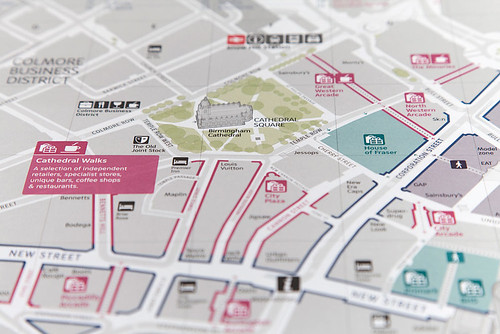
Interconnect Birmingham wayfinding project designed by City ID using the custom Monotype typeface Network. The brief was to build on the characteristics of VAG Rounded, while improving the quality and legibility of information.
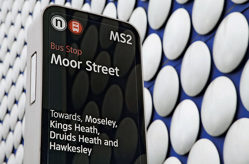
Shopping map, City ID, 2012.
First published in Eye no. 84 vol. 21, 2012
Eye is the world’s most beautiful and collectable graphic design journal, published quarterly for professional designers, students and anyone interested in critical, informed writing about graphic design and visual culture. It is available from all good design bookshops and online at the Eye shop, where you can buy subscriptions, back issues and single copies of the latest issue. You can see what Eye 84 looks like at Eye before You Buy on Vimeo.