
Thursday, 9:00am
17 December 2020
Waves of popularity
Graphic Design plays a key role in the re-emergence of Britain’s much-loved coastal resorts. The seventh and final instalment of Justin Burns’s series about seaside graphic design

The tide comes in. The tide goes out. The seaside is, by its very nature, a place in constant transition, writes Justin Burns.
The natural and built environment of resorts evolves physically and visually as we enjoy the beaches, fairgrounds and piers from dusk to dawn. Over the last century, the public perception of coastal towns has changed due to the offer of international travel, warmer climates and cultural exploration. The shifting sands of domestic seaside tourism have impacted on the economies and communities of the towns. Fewer visitors and reduced investment has led to the decline in popularity of some of our most iconic and grand resorts.
Blackpool, Health & Pleasure, Glorious Sea, Midland Railway, 1890.
Top. This is not fab, an environmental exhibit highlighting coastal erosion by author Justin Burns to be exhibited at the Artwaves Festival, Bridlington in March 2021, followed by a show at Margate in April.

In April 2019, the Select Committee on Regenerating Seaside Towns and Communities produced a report on ‘The Future of Seaside Towns’. The opening summary outlines that seaside towns ‘by which we principally mean coastal settlements that emerged as leisure and pleasure resorts in the nineteenth century have been neglected for too long.’ The appeal of the ‘edge of the land’, the associative escapism and endless views are recognised as one of the many attractive attributes of coastal towns. Its enduring appeal can also be interpreted – paradoxically – as a peripheral disadvantage, with some resorts geographically and socially isolated at the ‘end of the line’.
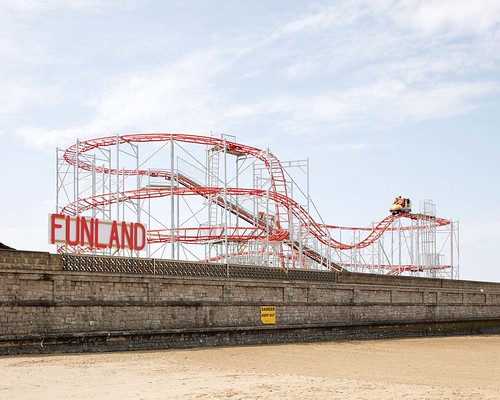
Funland in Weston-Super-Mare. Photograph by Rob Ball, 2019.
The Comedy Carpet, Blackpool, 2011. Design by Gordon Young and Why Not Associates.

The report acknowledges the difficulties in implementing a nationwide regeneration strategy, due to the localised, economic, and social complexities of the resorts. It cites comparisons between Bournemouth, Brighton and Blackpool, with the Lancashire resort recording the highest number of visitors to the seaside in the UK, with nineteen million of us flocking to see the Comedy Carpet and the famous Tower. However, while the visitor numbers are high and encouraging in times of uncertainty, a conflicting narrative is the serious deprivation issues within the region. The 2019 English Index of Multiple Deprivation ranked Blackpool as the most deprived of the 317 Local Authority areas in England.
Margate. Photograph: Justin Burns, 2020.

Across the UK, resorts are implementing initiatives to reimagine and re-identify a trip to the seaside. Identity is key, and yet problematic for many resorts in the UK. The Great British Seaside is, unfortunately, often still associated, with dated connotations and stereotypical assumptions. Many seaside towns are looking to re-establish their historical positions as desirable places to live, cultural hubs, and places to holiday again without the need for budget air travel.
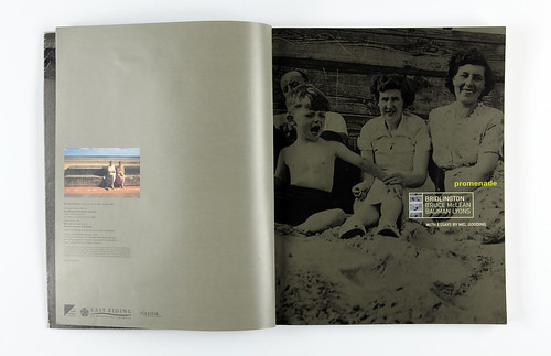
Spreads from a publication on Bridlington South Promenade, 2001. Design: Andy Edwards.
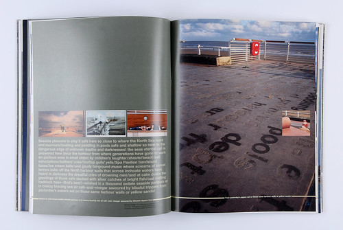
At a time of deep uncertainty for many UK seaside towns, the 1980s and 1990s saw several regional initiatives designed to reimagine the experience, perception and identity of the resorts. In 1995, Leeds architects Bauman Lyons and the artist Bruce Maclean were were commissioned by Bridlington Council to design and develop the South Promenade. The project blurred the boundaries between architecture, public art, graphic design and experiential design. The objective of the strategy was to ensure there was a connective appeal to visitors and residents alike, through a visually coherent approach that would alter the experience of our stroll along the prom. The design was informed by elementally themed sections connected by a ‘nautical mile’, a typographic design set in metre-length terrazzo paving slabs. The typographic walk would reflect the history of Bridlington, the environment, and the experience of being beside the seaside. The commission was awarded the RIBA Award for Architecture in June 2000, with the Jury recognising the impact of the design interventions on the East Riding shoreline: ‘Overall the project offers an original and contemporary solution to upgrading the images of the traditional seaside town. It’s a welcome change from the pastiche developments which are normally on offer’.
Signage at Dreamland, Margate, 2015. Design by Hemingway Design.

Turner Contemporary, Margate. Photograph: Justin Burns, 2019.

The role of graphic design – as a dialogic tool for change with local communities, visitors and stakeholders – is integral to the successful interpretation of the projects. Referential signifiers such as language, shape and colour are utilised in design strategies that balance the value of heritage with new attractions and experiences. This is evident in Margate which has seen investment over recent years with the re-imagined Dreamland Theme Park in 2015 and the opening of the Turner Contemporary Gallery in 2011. The re-design of the Dreamland by Hemingway Design evokes eras of high popularity for the British Seaside, with confectionery colour palettes from the 1950s, 1930s neon alongside a preserved 1920s mural in its giant ballroom. The identity is contemporary yet reflective of our past experiences to the seaside; appealing to a wider, inclusive demographic. It was awarded the Design Week award for Identity Design in 2016 which recognised the work as ‘A design, which manages to reconcile the past and the future of the park, whilst not forgetting its sunny, seaside outlook.’ Along the shoreline, the Turner Contemporary has strived to reflect and embody its regional artistic heritage, in attracting both local communities and new visitors to the gallery. The gallery and the town, has gained national and international recognition whilst recognising the importance of inclusivity through creative engagement.
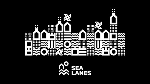
Branding proposal for Sea Lanes, Brighton. Design by multidisciplinary studio We Like Today, 2020.
Proposal for Sea Lanes, Brighton. Design by multidisciplinary studio We Like Today, 2020.

The value of community, cultural and social relationships is evident in the work of We Like Today, an interdisciplinary studio of designers and architects. Their recent project Sea Lanes in Brighton is a pop-up leisure and hospitality area on Madeira Drive, incorporating The National Open Water Swimming Centre with leisure and business units, which is due to open on the site in 2022. Creative director Rich Brett outlined the objective of Sea Lanes in an interview for Dezeen: ‘The idea … was to build an active and immersive destination, and open up a dialogue with the sea and the local community.’ Also, in Brighton is Circus Street, the redevelopment of a derelict market in the centre of the city.
Branding for Circus St., Brighton. Design by SEA Studios, 2019.
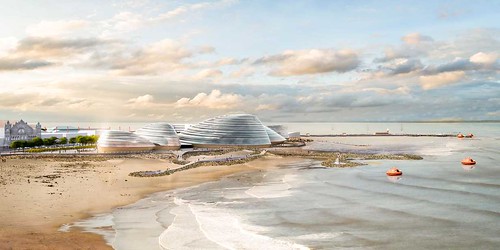
Eden Project North in Morecambe is a recent regeneration plan that aims to re-imagine the Lancashire resort and engage the public with the natural world, education, ecology and community. Regeneration strategies such as this seek to address and balance the quality of residential life with the economic benefits of tourism, so that the former is not detrimental to the latter. Localised initiatives such as Hack Morecambe and Creative Arts Festivals such as Artwaves in Bridlington continue to foster public engagement and action in redefining and experiencing the seaside in the 21st century. These projects encourage collective participation and ownership, embracing the past but developing new future-facing opportunities.
Eden Project North, Morecambe, 2020.
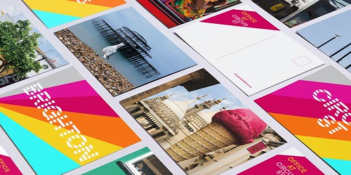
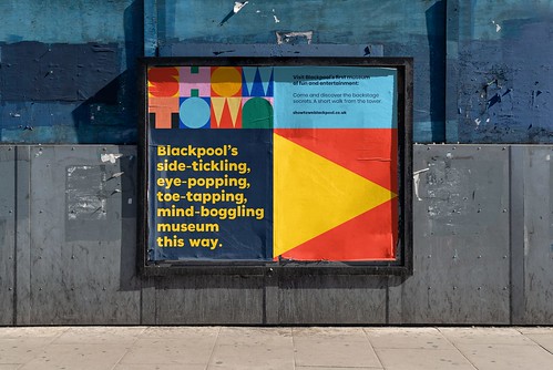
True North describes Blackpool as a place like no other, intending the resort, ‘to energise a place and engage new audiences.’ True North’s identity for Showtown, the new Blackpool Museum, uses a branding ‘toolkit’ with associative shapes, icons and a colour palette that is evocative of the entrainment and showbusiness archive. A cast of graphic icons accompanies an immersive experience that encourages us to look again at Blackpool and interpret its significance as an entertainment mecca and an international resort.
Branding materials and poster for ‘Showtown’, Blackpool Museum, Blackpool. Design by Made North, 2020.

This is a timely reminder that our resorts are unpredictable, ever-evolving, entertaining, eccentric, traditional and contemporary. Bold. Bracing even. Who wouldn’t like to be beside the seaside?
Photograph by Justin Burns, 2019.

Justin Burns, Head of Art & Design, Leeds School of Arts at Leeds Beckett University. Burns is exploring the graphic language of the seaside for a PhD.
Eye is the world’s most beautiful and collectable graphic design journal, published for professional designers, students and anyone interested in critical, informed writing about graphic design and visual culture. It is available from all good design bookshops and online at the Eye shop, where you can buy subscriptions and single issues.