
Summer 2016
The museum man
Willem Sandberg
Fraser Muggeridge
Design history
Graphic design
Reviews
Typography
Visual culture
Willem Sandberg: from type to image
De La Warr Pavilion, Bexhill-on-Sea, UK<br> 30 April – 4 September 2016<br> Curated by Carolien Glazenburg, Stedelijk Museum, Amsterdam, in collaboration with Fraser Muggeridge and De La Warr Pavilion. Exhibition design by Fraser Muggeridge Studio<br>
This confidently displayed show draws a line in the sand. It secures the De La Warr Pavilion’s place as the premier location for graphic design exhibitions outside the capital, it confirms an ongoing dialogue between English and continental Modernism, and it shines a light on an unlikely graphic design figure of the twentieth century. The life and work of Sandberg (1897-1984) was characterised by a knack for invention and survival, and an ability to juggle different roles.
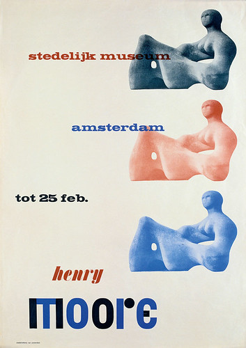
Poster, 1950, designed by Willem Sandberg in his own time while he was director of the Stedelijk. To save money, he re-used the plate of the Henry Moore catalogue cover image three times over. Image courtesy of Stedelijk Museum Amsterdam.
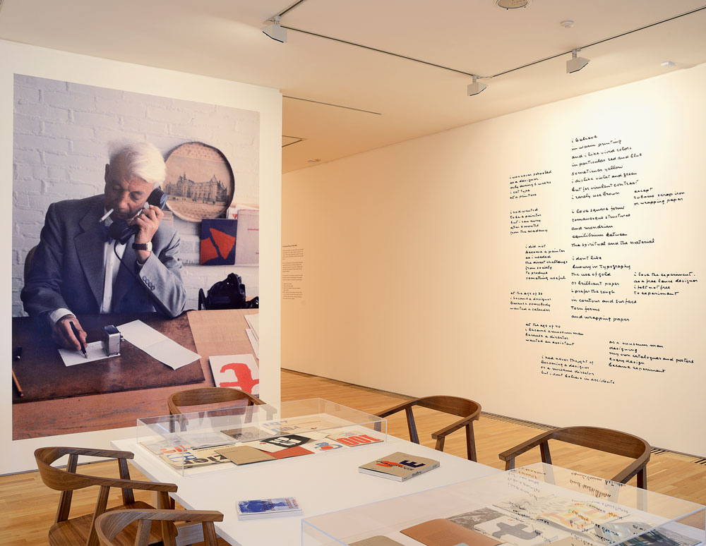
Top: ‘Willem Sandberg: from type to image’, De La Warr Pavilion. Installation photograph by Nigel Green, 2016.
A museum man, promoter of modern art and Dutch resistance fighter, Sandberg survived the war-torn years of 1940s Netherlands. In 1938 he had been curator and assistant director of the Stedelijk Museum in Amsterdam and travelled to Spain to study how art was protected in wartime. A video in the exhibition explains his crucial role in building bunkers in the dunes to protect works of art. Other less well prepared museums, such as the Rijksmuseum and the Van Gogh, benefited from his prudence.
In 1940 Sandberg narrowly escaped execution for his resistance activities, which included forging official documents to fool the German occupiers, and went into hiding. It was then he began his free experiments with typography. Limited resources and materials meant, of necessity, a stripped-down aesthetic. This economy of means stayed with Sandberg as his work developed in the following decades.
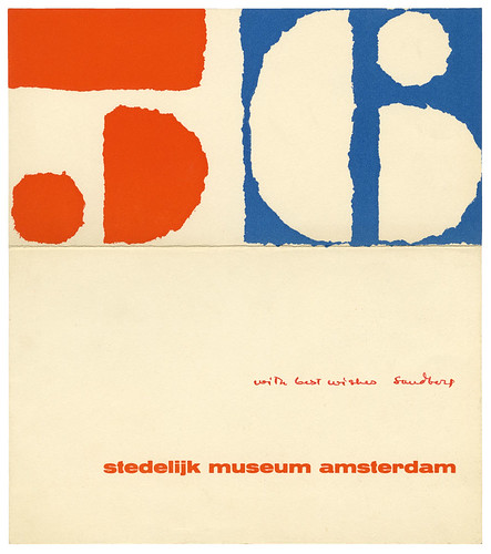
When the Second World War was over, Sandberg became director of the Stedelijk, a post he held until 1963. In addition, he undertook the design of catalogues and posters for exhibitions, mainly working in the evenings. Taking inspiration from the expressive letterpress work of H. N. Werkman (1882-1945), he made the most of what came to hand at the museum’s printers and rarely used photographic images. With no client but himself, Sandberg played in his own typographic sandpit. Using handcrafted shapes, rough textures, overlays, torn outlines, fluid arrangements of type and his own distinctive handwriting, he developed a style free of mechanical Modernist grids. On show are some 70 posters and at least as many catalogues and items of print.
New Year 1956 card, 1955, designed by Willem Sandberg.
With striking parallels to the De La Warr Pavilion, which was built in 1935 as a democratic space for public enjoyment, the Stedelijk was extended in the postwar period to include a café-restaurant, library, shop, terrace and educational facilities. Such ideas are now seen as routine for contemporary art spaces, but not then. Sandberg was remarkable for his vision of ‘engaging the public’ (as we might say now) and of working relentlessly to bring art to everyday audiences. He also established an identity for the museum through its distinctive and unstuffy use of design.
Perhaps we will come to see his most significant contribution not simply as a designer but as a design-inspired leader in museum management, a field where his influence has been more widespread, if less generally acknowledged.
The story of the art hidden beneath the dunes during the war years evokes an image of a windswept Dutch coastline – austere natural shapes constantly being remoulded by the elements, with occasional brightly coloured forms revealing themselves through the sand, like seaside toys left behind on the beach – an analogy for Sandberg’s own work. This image becomes more compelling when one realises his surname, in translation, combines ‘sand’ with ‘mountain’ or ‘hill’. And what is a dune but a ‘sand hill’?
Not a bad image by which to remember this energetic curator-director-designer who protected, promoted and practised visual art, and whose work currently lines the walls of a seaside Modernist art space.
See ‘Willem Sandberg: Warm printing’ in Eye 25 and ‘The many sides of Willem Sandberg’ in Eye 56.
Jim Northover, designer, writer, consultant, London and Rye
First published in Eye no. 92 vol. 23, 2016
Eye is the world’s most beautiful and collectable graphic design journal, published quarterly for professional designers, students and anyone interested in critical, informed writing about graphic design and visual culture. It is available from all good design bookshops and online at the Eye shop, where you can buy subscriptions and single issues. You can see what Eye 92 looks like at Eye before You Buy on Vimeo.